- Home
- About Us
- Products
- Exterior Signs
- Interior Signs
- Vehicle Wraps and Graphics
- Event Signs
- Custom Signs
- Services
- Industries
- Locations Served
- Gallery
- Blog
- Customer Portal
- Contact Us

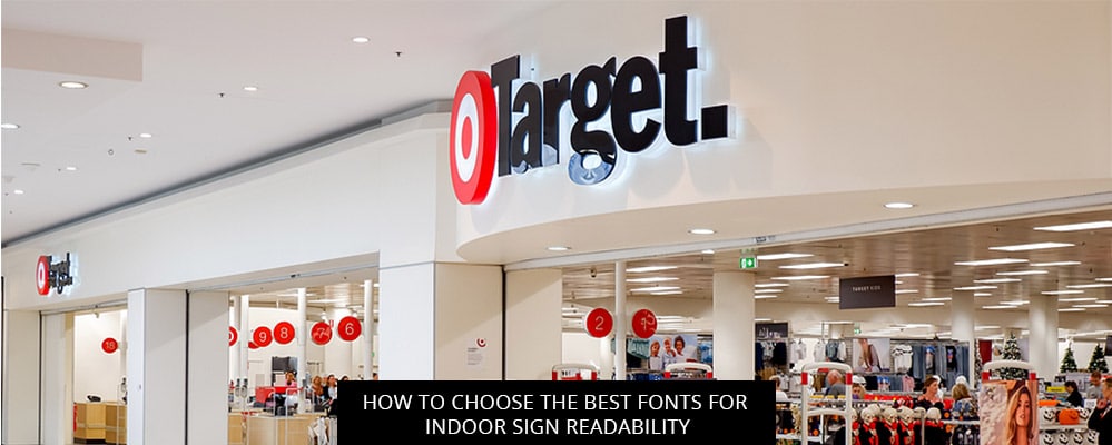
Today’s post digs into research by the Interdisciplinary Journal of Signage and Wayfinding to help Southfield businesses choose the best fonts for their custom indoor signs.
Read on to learn how to up indoor sign legibility, or call 1-248-354-8346 to speak directly with an indoor sign expert in Southfield, Michigan.
In a 2019 report for the Interdisciplinary Journal of Signage and Wayfinding, researchers Philip Garvey, Wei-Yin Eie, and M. Jennifer Klena set out to assess the legibility of a large set of existing indoor sign display fonts, in hopes of crowning a handful of top performers.
To test indoor sign font legibility, they gathered 64 subjects ranging from 19 to 87 years of age, and showed them 64 different displays using 33 font variants. Each display was set up to simulate a pedestrian approaching an indoor sign, with the image starting very small before growing larger. Subjects first attempted to read the indoor sign display at the smallest possible size, then threshold legibility was determined for each font.
Here’s some of their key findings:
Ready to start exploring your indoor sign font options?
SignScapes is a leading provider of indoor sign solutions for businesses, government facilities, and private events throughout Southfield and all the surrounding areas, including:
Remote collaborations and nationwide indoor sign deliveries are also available for clients located outside of Michigan.
Call 1-248-354-8346 or visit the SignScapes website to book a free consultation and get a same-day quote on any custom indoor sign order.
References
Garvey, P. M., Eie, W. Y., & Klenna, M. J. (2016). The effect of font characteristics on large format display. Interdisciplinary Journal of Signage and Wayfinding, 1(1).
Back